Bookshelves and closet shelves- backgrounds

Give your shelves a brand new look by simply adding some pattern or color to the back.
Here are some images that I enjoy.


I am going to remodel my master bedroom closet and I want to either paint the walls, wallpaper them or both.  The pattern and/or color will be seen through the clothing and behind the shelving which will add some depth and interest.  Have to decide on a color!


I bought this bowl as a Christmas gift for someone but I love it. Might keep it for myself!

Is that wrong? HAHAHA

Here are two pictures I took of the bowl.  It looks so much nicer in person.
I got the bowl through Joss & Main.


Started to redecorate the loft space in my house-

Got this sofa bed from CB2-

It folds flat so that you can use it as a bed.  The reviews I read were correct.  It is kinda hard so if we use it as a bed, we will have to get an egg crate and then cover it with a bed sheet so that it is more comfortable.

I am not going to show before and after images until the room is closer to "after."  

I also bought this end table from Joss & Main.

There are three glass shelves.  The glass is sort of tinted this interesting gold color.  I am not sure what I want to display on the bottom two shelves yet.

The table was delivered and when I opened the box, the top layer or glass was in a million pieces.  It was not packed very well.  I called Joss & Main.  They don't take returns but they were super apologetic and offered me a new piece.  I thought I was going to get just the top piece of glass as a replacement.  Nope.  They are sending me an entirely new table.  If I can manage to get the top piece of glass made at a local frame store- I will have two end tables!  Super psyched.

Here are the pillows I bought - also from Joss & Main- for the sofa.
Elisabeth Michael navy chevron pillow-


This pillow looks great with the orange sofa.  I am loving the orange and navy combo.

Here are the other pillows I purchased from Joss & Main- to go with the orange sofa- These are also by Elisabeth Michael- greek key pillow in powder blue.

Love this pattern.  Reminds me of earrings my mom brought back for me from Greece.

The room is coming along but slowly....so many things I want to do to it!


LOVE Robin Baron and Simplifying Fabulous!

I have been following Robin on Facebook and on her blog.  She gave me some "fabulous" advice for a DIY project that I am going to try.  She has amazing taste and I just found out through her blog that she has a collection on Joss & Main which I also love!

Here are some of Robin's insipirational decor ideas and photos.  Definitely check out her blog:


I am loving the colors of the room on the left.  The pop of yellow is nice.
These are Jennifer Brouwer Designs.  Hollywood glam is my favorite.


How unique and beautiful is this coffee table? Wow.  I love it!  


Here is Robin strutting her studs!  Studded bowls.


I am digging this great pieces with more studs!  Robin really has my kind of taste!  I love me a nail head.  Cute side table with the detail on the sides and who wouldn't want a serving tray that looks like this?  I want one!  The darker one would look great in my living room.

Don't forget to check out Robin's blog- she is really friendly and super helpful.  If you have any question about design, she will help!


Consolidate space in your closet -

The Container Store has great, thin, non-slip hangers.  A package of ten hangers are only $6.99.
I highly recommend these- you can buy more clothes! 

My husband and I are planning to reconstruct our closet.  We had Closets by Design come out for an estimate and we are having California Closets here next week to get another estimate.  We aren't sure which company we want to use but these hangers are a definite addition no matter what we do with the actual closet design.


Pictures of the closet before and after to come.....


Joss and Main


I could make a great room out of these items by Loni M & more....


How to mix patterns and colors in home decor

Use the color wheel in order to figure out what colors "match."


Purple derives from reds and blues.
Green comes from yellows and blues.

Colors that are opposite on the wheel are complimentary and when put together are more vivid.  An example of this would be green and red.
Colors that are next to each other go together because they are analagous (they share a common hue).  An example of analagous colors might be mustard and yellow-green.
Three equally spaced colors on the wheel are triads and these look good together- a traditional use of triads might be that one color is used a little less than the other two.

Stick to this rule for scale: one small scale pattern, one medium scale pattern and one large scale pattern.
There are exceptions to this when it comes to the direction and texture of the pattern.


If you are new to decorating and do not know how to mix patterns, you do not want to spend a lot of money, I would start with pillows.  Pillows are less expensive and they can be easily replaced.  Go for a stripe, a solid, a small print, a large print and a floral pattern.  

Your local fabric store will usually give you swatches to keep or take home to try them out.  Try searching on line for your color scheme and collect ideas.

These first image is of my living room.  I have a base color- metallic and a pop of yellow.  
I have used a medium scale pattern on the pillows with a large scale pattern on other pillows.
The zebra print is sort of striped and is a different texture because the pillow is woven.
I will keep the metallics as the base and change out the pillows if I want a new look.


The orange colored wall paper (above) sets the background and is not too busy.  The addition of patterned pillows adds interest.  Notice, there is a floral pattern pillow, a small graphic print and then a large graphic print.  Some of the pillows have the orange color that is found in the wallpaper and then there is a blue pillow for a pop of color.  The floral pillow ties together the blue and orange.  The sofa is a neutral.  This is a good idea so that redecorating the room does not require purchasing new furniture.  The pillows can be replaced and it would give the room an entirely brand new and different look!


This bedroom (above) has a color palette of orange, grey and blue.  Solid orange, a stripe, a graphic print and a floral pattern and solid whites.


Thomas Paul for Duralee - Decorators Best.  The yellow, blue and green are super bold.  This is a commitment!  Bright and happy.  Notice all colors are on the color wheel next to each other.


These colors from Calico Corners are also on the color wheel next to each other (greens, blues and yellows).  They are more subtle because they are muted shades.  Notice the neutral sofa again.  Stripes on the curtains, a paisley type pattern on the ottoman, checkers and small graphic print pillows and the large graphic print for the wallpaper.


Shades of gray are known to be neutrals because they go with everything.  The values of light gray are balances with darker hues of black.  This look combines traditional with the area rug and chandelier and photos.  A touch of contemporary with the metallic urns and pillows balances out the look.


Purple in this room (above) from Country Living is considered the "neutral."  Somehow this works.  The reds are warm colors on the color wheel so a blue shade mixed in provides a cool accent and gives the room more depth.  The touches of green in the flowers and the art work also add to the cool accent since too much red can be overwhelming.


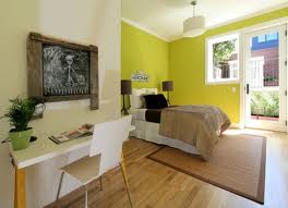
The bedroom (above) from Better Homes and Gardens takes on opposites on the color wheel using blues and oranges.  This works because there are combinations of shades and patterns.  None of the patterns compete because the scales are different and the direction of the patterns are different.


Love this look (above) from Elle Decor.  It looks collected over time from travels and the eclectic look doesn't look forced.  Even though the walls have a pattern, the scale is small and the color is neutral.  Shades of blues and reds are repeated throughout the space.  The rug is a large scale print. This works with the curtains, which is also a large scale print because the pattern on the rug runs sort of vertically toward the wall and the curtain print is ethnic/global and runs vertically.  Directionally, they do not compete.  Note, the furniture is neutral and solid in color.  

Other colors and patterns in tangerine I love from HGTV:


Good luck with your color and patterns!


How large should an area rug be?

An area rug should be large enough so that the front legs of a sofa are sitting on top of the rug.  However, all of the legs can be placed on the area rug as well.  When you measure your room, take into consideration that only the front legs need to be on top of the area rug.  The usual rule of thumb is that sixteen inches of space or flooring should show around the perimeter of the room.  This does not work nowadays because people are building open concept spaces.  This really only works with rooms that are isolated from others.  If you are going to break the "rules" then there are some ways to do that....


The above image shows furniture- front legs on the rug and back legs off the rug.  This allows the feeling of a larger area rug for less cost.  This rug looks to be 6 x 9.  


The above image in neutrals shows some of the furniture with front legs on the rug.  The sofa has only the two front legs of the sofa on the rug and the chair shows all four legs on the rug.  The size of the room can sometimes dictate this option.


This image demonstrates how anything goes- all legs on the rug. Be sure to layout the furniture in the room before measuring for the rug size.  If the measurements are off and the furniture does not all fit on the rug then you will have to modify your design and potentially do the front legs only option.  

The above image shows an area rug with no furniture on top of it.   This can also work if you are trying to bring some texture, color or pattern into the room.  The room must be large enough to accommodate this.  

Here is a dining room that permits an area rug.  The rug should extend 24 inches around the table so that chairs can sit completely on top of the rug without getting caught in the edge and or sitting half on the rug and half off the rug


This bedroom shows the rug underneath the entirety of the bed itself.


The bed in the photo above also shows that the bed is placed on the area rug.  The area rug peeks out at the foot of the bed and around the two sides of the bed.

Perhaps the rug you like or have is small.  That is okay in the bedoom as long as it is placed at the end of the bed.  Then, the part of the area rug that peeks out is at the foot of the bed and on the sides but not at the headboard or top half of the bed.  That looks grounded too.

This bed also shows that the area rug is completely underneath the bed and peeking out on the sides and the foot of the bed.  

The "rule" is that between 12-18 inches of rug peeks out on all three sides.

In larger rooms, there may be a need for more than one area rug.


Overlapping rugs are trendy and are seen many times involving animal skin rugs as shown above.  


While there are some design rules when it comes to area rugs and layout and spacing, there are ways in which to break these rules.  If it looks weird or does not feel right, then it may not be right.  Keep playing with the layout of the furniture too.